Master the Art of High-Converting Landing Pages: Key Elements for Affiliate Success
By Duncan Whitmore
An effective landing page can make or break your affiliate marketing success. It is one of the key planks in your lead generation funnel, and one you simply have to get right - especially if you rely on organic traffic.
While every affiliate marketer dreams of skyrocketing conversion rates, this is likely to be impossible unless you account for the subtle nuances of landing page design.
So whether you're a seasoned pro or new to the affiliate realm, understanding the key elements of a high-converting affiliate page is essential.
Buckle up as we delve into actionable tips that will help you craft landing pages that not only engage visitors but also drive impressive conversions.
The Foundation: Knowing Your Audience
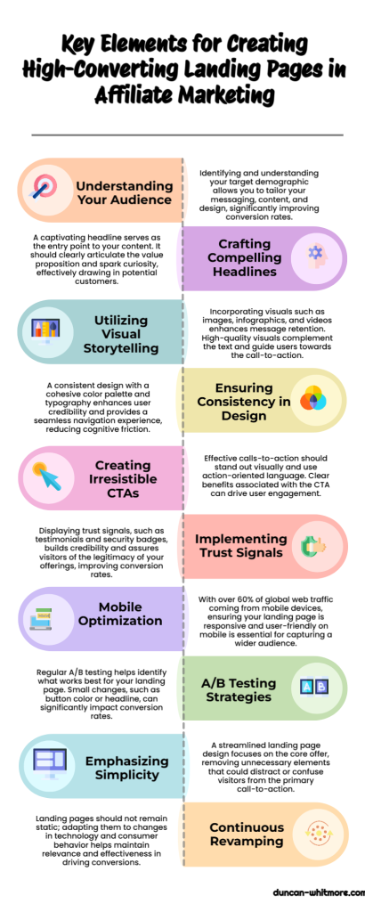
Before diving into the nuts and bolts of landing page design, it's crucial to grasp who your audience is. Now this is typical advice that I give all the time in my articles, but that's only because it's immensely valuable.
The clearer you are about your target demographic — be it millennials looking for skincare tips or tech enthusiasts craving the latest gadgets — the sharper your messaging will be.
Tailoring your content, design, and call-to-action (CTA) to resonate with your audience's sensibilities can significantly elevate your conversion metrics.
Element 1: Crafting Compelling Headlines
The headline is your hook; it's the doorway to your content. If it doesn’t capture attention instantly, you've lost your chance. In fact, you must write a headline so powerful that it makes people stop in their tracks.
So ensure your headline encapsulates your page’s offering while triggering curiosity. It should offer a clear value proposition and address underlying problems that your product or service solves.
A good formula for accomplishing this is "the benefit without the cost." For example, if you are in the weight loss niche: "How to lose X pounds in 30 days [the benefit] without giving up your favorite foods [the cost]."
Element 2: Engage with Visual Storytelling
Words build narratives, but visuals breathe life into those stories. According to one study, visuals increase your message retention by 42% more than plain text.[1]
Incorporate high-quality images, infographics, or short videos that resonate with your product or service.
Design elements should align with your brand aesthetics and be strategically placed to guide the eye toward the CTA, an integral part of elements of a high-converting affiliate page.
Element 3: Consistency is Critical
When it comes to design, consistency isn’t just important — it’s imperative. A consistent color palette, typography, and language style cultivate a cohesive user experience, thus enhancing credibility and trust.
Break down your landing page into digestible sections using headings and subheadings, along with a well-defined grid layout.
The idea is to provide visitors with a seamless journey from the headline to the CTA without stirring any cognitive friction.
Element 4: Make CTAs Irresistible
Unlike the tedious ‘Click Here,’ crafting an irresistible CTA involves creativity and psychology. The CTA should be a visually distinct button that clearly states what users will get after clicking.
Employ action verbs like “Download,” “Get,” or “Learn More,” followed by an explicit benefit.
For example, “Get Your Free eBook Now” creates a sense of urgency and value, urging prospects to take action.
Element 5: Trust Signals are Non-Negotiable
Players in the affiliate space know that trust is currency. Displaying trust signals like testimonials, customer reviews, security badges, and affiliations with reputable brands can drastically up the ante.
These elements, part of a high-converting affiliate page, offer social proof that your product is not only legitimate but also worthy of investment.
Supplement these with real-life success stories that illustrate how consumers have benefited.
Element 6: Optimize for Mobile
Now, let's address something that is easily forgotten: mobile optimization.
As of this year, mobile devices account for over 60.4% of global website traffic.[2] This trend isn’t showing signs of reversing anytime soon. So optimizing your landing page for mobile ensures you capture this vast audience segment.
Employ a responsive design that adapts to varied screen sizes, retains quick load times, and maintains functionality across devices.

Element 7: A/B Testing is Your Best Friend
Finally, no landing page is set in stone. The digital world is dynamic, and what works today may not work tomorrow.
A/B testing, or split testing, is therefore indispensable. Test different headlines, images, colors, and CTAs to discern what resonates most with your audience.
Real-life example: I once managed to increase my opt-in rate from around 50% to 70% purely by testing the color of the CTA button (light blue was the winner, in case you're curious).
Tools like Google Optimize and Optimizely provide valuable insights into performance metrics, enabling you to make data-driven decisions for tweaks and transformations.
Element 8: Keep it Simple
While a landing page is not as basic as a squeeze page, it is still the case that simplicity wins the day. That means conveying the essence of your offer with as few impediments towards the visitor fulfilling the CTA as possible.
So for every element you add to your landing page, ask yourself: "What is this aspect of my page doing to encourage a click on the CTA button?"
Any element that is not contributing to that function - e.g. superfluous information, umpteen videos and images - should be dispensed with.
Conclusion: Revamp and Reap Rewards
The art of crafting a high-converting affiliate landing page integrates a multitude of elements — each contributing its unique facet to the conversion puzzle. By harmonizing content quality with compelling visuals, ensuring trust, optimizing for speed and mobile, and fine-tuning through A/B testing, you set the stage for successful conversions.
Remember, a landing page is not a static entity; it evolves alongside technology and consumer behavior.
Armed with these insights and actionable tips, you're one step closer to transforming visitors into loyal consumers and, ultimately, amplifying your affiliate earnings.
* * * * *


3 replies to "Master the Art of High-Converting Landing Pages: Key Elements for Affiliate Success"
[…] >> Read More […]
[…] The first interaction a potential customer has with your affiliate offer is often on a landing page. […]
[…] personalized content experiences. Tailored emails, product recommendations, and even personalized landing pages can boost engagement and conversions by making prospects feel seen and […]